Fractions of a iOS design system have previously been implemented in isolation. Colours had been defined to support light and dark mode for a single brand. This in a way that it can't be re-used for Kindred's other brands and products.
The main goal of this project was to create and define the design foundations for a multi-brand design system. This including colours, typography, icons & logos as well as documenting how to use them in design and code.
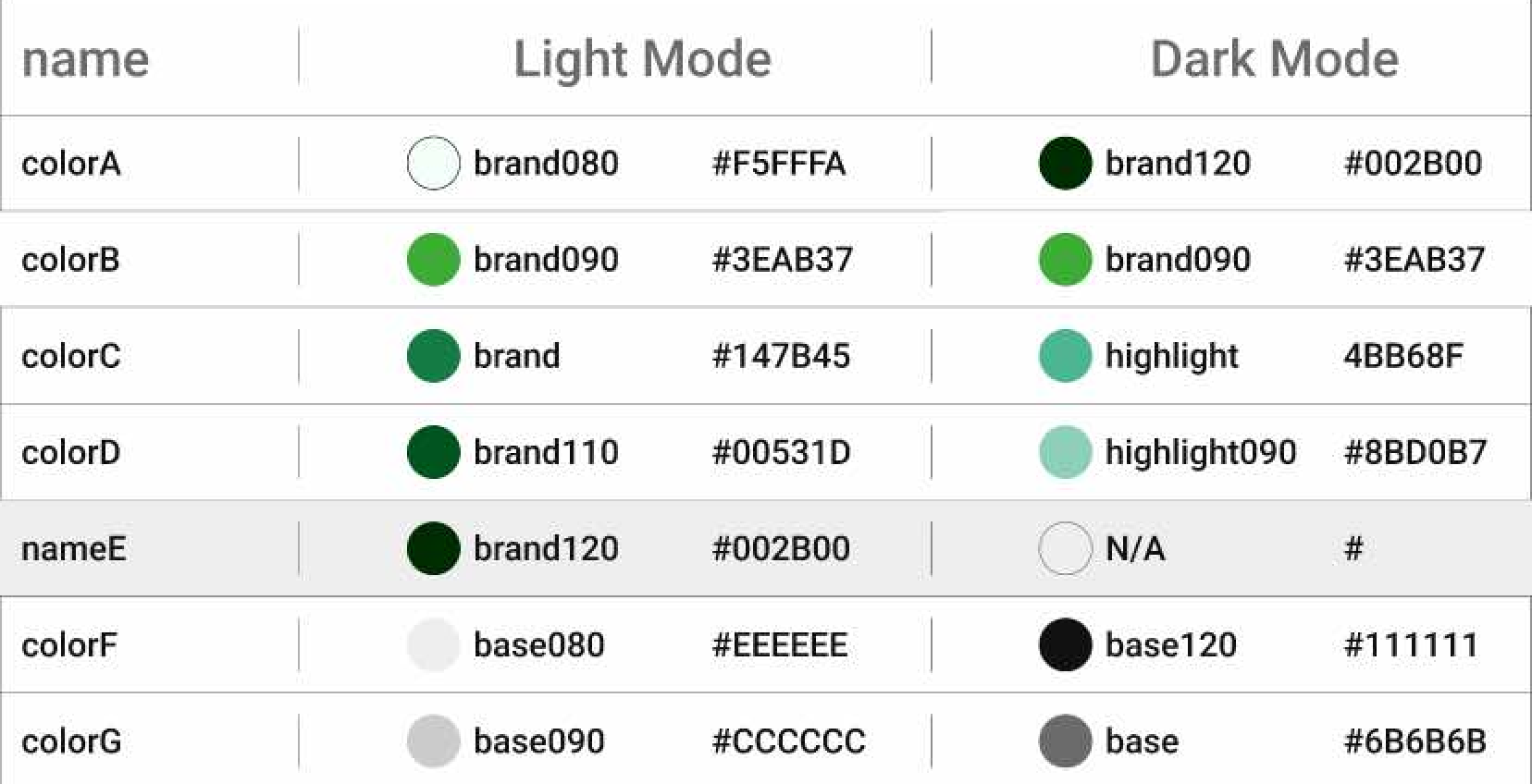
We recieved a walkthrough of what had previously been implemented and why. After that we quickly concluded that the colours can't be built upon as it had been created in an inconsistent manner using colours from our web design sytem that was not created for light & dark mode. The colours was also named using non-descriptive terminology that also would not work if the number of colours would increase. However the existing typography was consistent with our web design system which we decided to keep for now.
We conducted an exercise before beginning to define new colours for our iOS design system. This to understand how colours are intended to be used for iOS. After gathering valuable resources we decided that three sets of colours is going to be needed. One dynamic colour set where the colours adapt to users appearance settings (i.e. light or dark mode). Then a fixed colour set for cases where a colour should remain the same in both light and dark mode. Lastly a colour set for UI elements that requires specific colour mapping apart from the dynanic colour set.
The process of defining the design foundations was done in close collaboration with developers, designers and product managers to ensure all needs and expectaions were met.
Three sets of colours was added into the design system: dynamic, fixed and UI element colours.
Fixed colours was added and defined based on our exisisting web design system colours. The colours will not adapt based on user appearance settings.
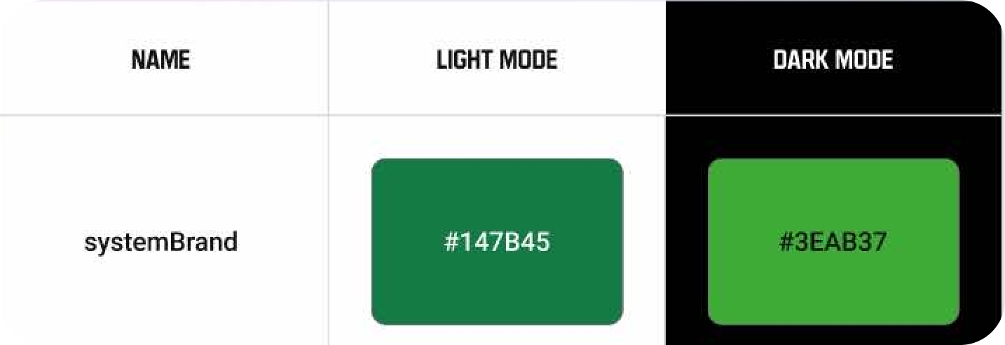
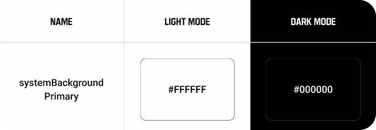
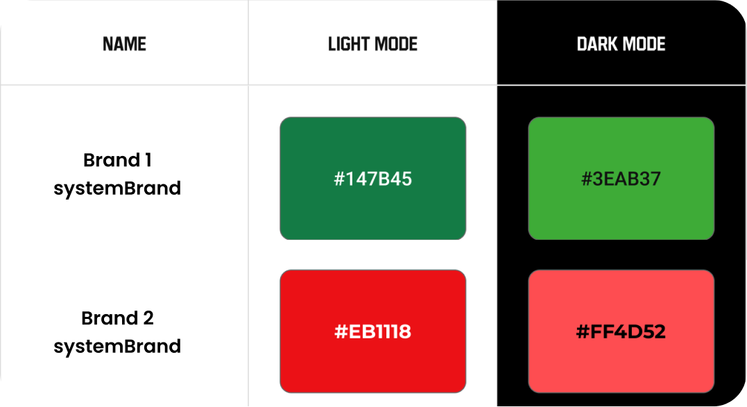
Dynamic colours was defined using the prefix "system" to indicate that these adapts to a users preferred appearance settings.
UI element colours was defined to be used for styling components such as buttons, text, backgrounds and icons.
As our apps consists of both native iOS and web views we decided to stay consistent with our web design system typography. This until web views have been fully replaced.
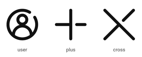
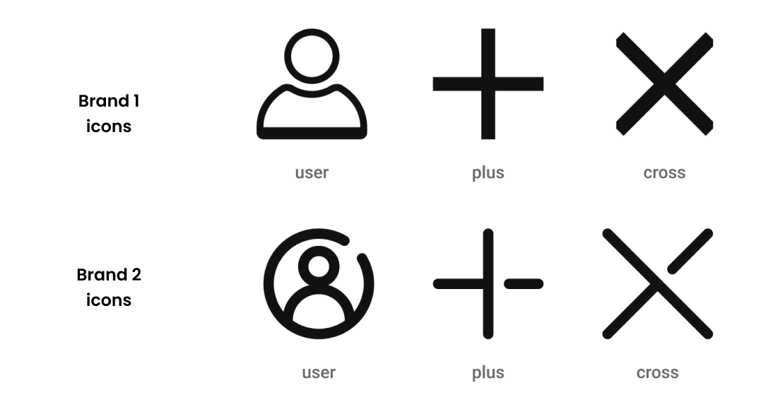
A set of icons was added and named consistently. A basic set of icons is provided for all brands unless a specific icon set is intended to be used.
Brand logos was added and named so that they can easily be swapped. Naming example: brandLogo and brandIcon.
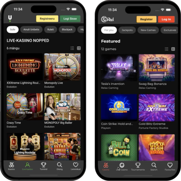
Each brand are using the same naming convention for it's design foundations to ensure that everything looks and behave as expected when switching brands. Below are examples of colours and icons is represented across two brands.
From previously only having an app for one of our brands. We know have support to release another ones for any of our brands.
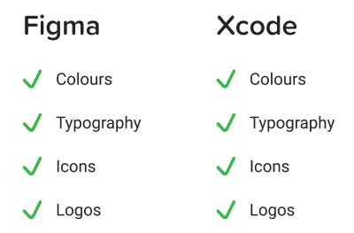
All the design foundations that have been defined for the design system have been documented and implemented. A Figma library for designers and packages with enums, bundles and packages within Xcode.
Kindred now has solid iOS design system foundation that supports multi-branding and light / dark mode. It has been designed to easily be able to add new brands when needed into the design system.
The design system can be used to design user interfaces within Figma with our new library that represents the code implementation in Xcode. Developers can utilise the design system via the enums, packages and bundles within Xcode.